A couple of months ago, I was presented with the most amazing opportunity! My friend Irvin of Eat The Love and I were invited to lead a panel at Blog Her Food in Atlanta, GA. The subject? Design & Branding for Food Bloggers 101. Irvin and I worked hard on our presentation, and it was so rewarding. I felt like our work paid off -with so many people asking follow up questions and inquiring whether our slides would be available online. We assured everyone, we would share– all 165+ slides!

Irvin has posted part 1 which encompasses defining your brand and creating a logo and part 2 about color palettes and mood board. As part of our presentation at Blog Her Food, we created a little joint venture; it’s called Chit Chat & Chew. During our branding exercise, we chose some adjectives like “Sweet, Bright, Fun, Quirky, Smart, Bold, & Friendly”. You might notice that they suit us pretty well- if you follow our blogs at all. (Irvin talks about how to define your brand in much further detail in part 1). We also chose a bright & sunny color palette balanced by some sophisticated neutrals. On this slide are some images we picked for inspiration, this is called a mood board. Finally you’ll see our logo which is a simple wordmark.

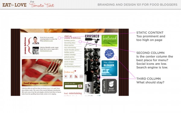
For the purposes of this project, we decided to make believe that Chit Chat & Chew was an existing site that was in need of a redesign. Here, you’ll see the original Chit Chat & Chew.

While it’s not a bad site, the first thing you might notice is that the colors don’t seem so sweet, bright or quirky, the branding feels more than a little off from our mood board, and well, the name is completely different! But since I’m also a user interface designer I want to dig a little deeper into this site.

First things first. The header is too tall. I know many of you are saying, “But I am a great photographer, I want to show off my beautiful photo”. I will give you three reasons why a super tall header is probably doing you a disservice.
- You are pushing your content way down the page. People come to read your content and to see your beautiful photos, but not the header photo…
- Your beautiful photo is only super interesting the first time someone sees it- and may in fact be detracting from the fresh content below it
- Your photo probably has text and a menu over it, so unless you have some design skills, it may not look as beautiful as you think
And speaking of design skills & photo headers, it’s difficult to read the tagline, we really “heart” entertaining.

Below the header, things get more interesting. Again, this is not a terrible site, but there is so much we can do to engage readers right away.
- Irvin’s and my bios are front and center. People read from the top left, so after that big header, that slot, is the most important one. We should be filling it with fresh and exciting content.
- The navigation for the site is smack dab in the center which makes it feel busy. Also, there is no link to the homepage in the navigation.
- The ads and awards take up almost half of the horizontal width of the page. We may know they’re awards and recognitions, but chances are, they all look like ads to the reader.
- The fresh content is so low on the page- is the reader going to stick around for it?
- The search is awfully low on the page, please please please put your search somewhere that people are used to finding it. That’s top right usually.
- The social media is also pretty buried. Irvin and I are both very active in social media and it is very important in our daily lives and in our blogging strategy. For us, it needs to be way more prominent.
- Tag cloud? Is a tag cloud the best way to display your tags? This is debatable and somewhat of a personal choice, though I can say they’re falling out of favor in the design and usability community. They can convey useful information about your site, but I believe that proper branding and good display of content plus related content plugins can achieve the same results without tag clouds. You can also use tags in other ways- for instance at the end of a story. ie: more: blueberries, desserts, ice cream

So, those are the negatives. What are the positives?
- We like the curly brackets around we really [heart] entertaining. Also, that tagline isn’t bad.
- Striped backgrounds are cute, although the color is too dark and the stripe is too heavy.
Curly brackets and stripey backgrounds do not a site make. Chit Chat & Chew would have to be built from the ground up. So, where to start?

Make a list of sites that inspire you- you can start with a big list, but you should whittle it down to fewer than 10. They don’t all have to be food blogs, but some of them definitely should. They don’t have to look alike. You don’t have to want your site to look exactly like theirs. These are just sites that inspire you visually, that make you think “wow, that’s really fantastic” or “beautiful” or “badass” every time you go there. When you’ve got your final sites, list a few things you like about each one and be very specific.
Irvin and I chose the following sites:
La Tartine Gourmande
We loved the fresh colors, big beautiful photos, clear navigation, and strong wordmark from Bea’s award winning site

What Katie Ate:
This Australian site impressed us with clean design, rich photography, lots of negative space, and whimsical typography

Green Kitchen Stories:
Bright Colors and big photos are the big draw on this site. We also loved the layout of the photos themselves and how four stories appear above the fold

Eating is Art:
Tricia’s stunningly simple site makes excellent use of white space again with striking colors, rich and luscious photos, bold type, and a fun wordmark

The Way We Ate:
Once again, we’re wooed by strong typography, and big photos, the clear navigation is very nice, and the subtle sophisticated colors are so appealing.

Penny De Los Santos
Penny’s site focuses on the photos and her tall header is an exception to the rule. It is both well-designed AND the photos refresh on reload, there is a lot of white space, a nice use of typography, and of course, the photos are top notch.

Putting It Together
Once you’ve identified what you like about each of your sites, it’s time to find the common thread between the sites. For our six sites, there was a very clear theme
- Strong bold typography: Each of these sites has type that has a voice. The typography has personality and helps establish the voice of a site. If you read Parts 1 & 2 on Irvin’s blog, you’ll know how important typography is to us.
- Lots of white space: We love the use of negative space or white space to convey a feeling of spaciousness. Penny De Los Santos, The Way We Ate, What Katie Ate, and Eating is Art have an especially open feeling. We definitely want openness in our new site.
- Clear Navigation: It’s easy to get around each of these sites, and we really want to take that into account when we’re redesigning Chit Chat & Chew.
- Big Juicy Photos: Couldn’t you just bite into those berries, snuggle those piglets, sip that juice, pull up to Katie’s rustic table, sit on the grass for a picnic? We want to invite people into our lives the way these sites have done.

Once you have a list of goals/guidelines like this, you can start to think about building your site! Since Irvin and I are designers, of course, we wireframed and designed our site, but all of these principals can also apply when using WordPress, Blogger, or Tumbler themes.
I’ll bet you just can’t wait to see what comes next, but…
How about the final piece, part 4 on Tuesday?


THANK YOU THANK YOU for all this WORK!!! I'm the beneficiary of your brilliance!!! Ally 🙂
This is fabulous!! Thank you SO MUCH for sharing!!!
Thank you for the AWESOME mention! Seriously, you both have made my month :). hugs!
I need to set aside a couple of hours when my brain is fresh on a Saturday morning and go through these posts! Thanks for sharing all this.
How is the move going?
Awesome! Thanks for posting — this could not come at a better time!
Great information!
Where is Part 4? Have you posted it?
Thanks
Thanks for so much wonderful information!
Did you publish Part 4?
Thanks